Theming
The nook’s chrome - top bar, compact pill, banner, Settings, companions, and the
surface itself - is drawn from one value: a NookTheme. A theme is plain data, so
you can write it in Swift, load it from a JSON file, ship several, and reload one
live while you edit it.
You can leave all of this alone (the standard theme is the framework’s own look, value for value), turn a few knobs, or override any single part of the chrome.
NookApp.main(theme: NookTheme(accent: "#3399FF", radius: .large)) { MyHomeView() }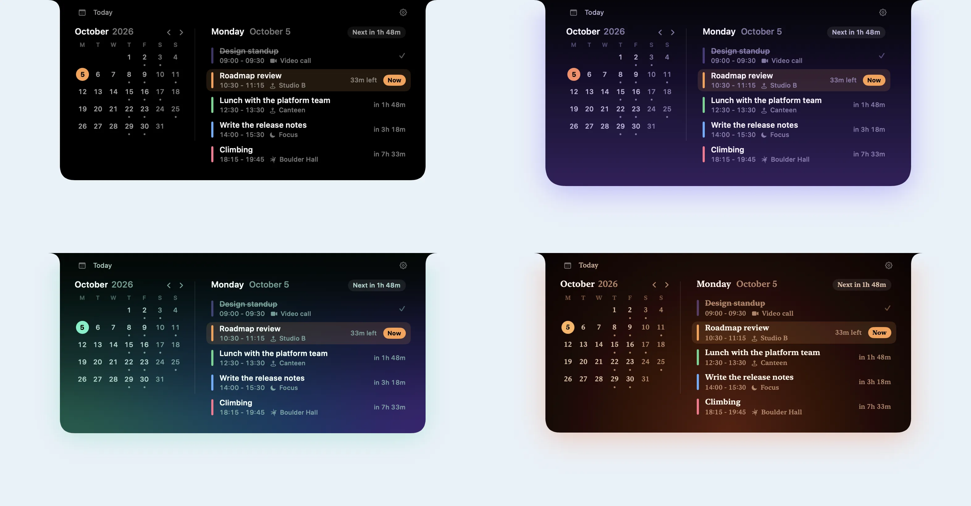
The same scene in the standard theme and in the three sample theme files: Dusk, Aurora, and Ember. Only the theme changes; the app is the same.
Three tiers
Section titled “Three tiers”A theme has three layers. Each layer defaults from the one above it, so changing one value moves everything that follows it.
| Tier | What it is | Example |
|---|---|---|
| Knobs | A dozen properties on NookTheme |
accent, radius, scale, fontDesign, motion |
| Semantic tokens | Shared values the chrome defaults from | space.md, radius.lg, type.body, color.label.secondary, spring.default |
| Component tokens | One per chrome field: every NookChromeMetrics, NookChromeTypography, and NookChromeMotion field |
banner.cornerRadius, banner.message.font, motion.statusBanner |
banner.cornerRadius defaults to {radius.md}, which is 10 at the standard
radius; banner.padding.vertical defaults to 7 at scale 1; topBar.height stays
24 whatever the scale, because it is tied to the menu bar. With
NookTheme.standard every value resolves to exactly what the chrome drew before
themes existed.
var theme = NookTheme( accent: "#3399FF", // color.accent: interactive tint radius: .large, // .none, .small, .standard, .large, or .factor(1.25) scale: 1.05, // spacing and type, 0.5...2 fontDesign: .rounded, // cascaded over the chrome's text fontWidth: .condensed, motion: .calm // .standard, .calm (no overshoot), .expressive)theme.soundVolume = 0.6 // multiplies every sound's volume; see Sounds belowFour knobs pin a choice the person would otherwise make in Settings; see Host theme and the person’s choices.
Tokens
Section titled “Tokens”Override any token by id. Each kind of token has its own id type, so a color cannot land where a length belongs:
var theme = NookTheme()theme.tokens[.spaceMD] = 9 // every gap that defaults to ittheme.tokens[.labelSecondary] = .adaptive(.init(dark: .white(opacity: 0.66), light: .black(opacity: 0.55)))theme.tokens[.destructive] = "#FF453A"theme.tokens[.bannerCornerRadius] = .token(.radiusLG) // a component tokentheme.tokens[.bannerMessage] = NookFontSpec(role: .typeBody, weight: .semibold)theme.tokens[.statusBanner] = .reference(.springSnappy)theme.tokens[.chrome] = NookShadowSpec(color: .black(opacity: 0.35), radius: 12, y: 4)Numbers are written at scale 1: a spacing or type token multiplies a number by the
scale knob, and a radius token by the radius knob. A reference takes the other
token’s value, already scaled.
The color roles are color.label.primary, .secondary, .tertiary,
.quaternary, color.fill.subtle, color.stroke.subtle, color.icon.inactive,
color.accent, color.surface (the solid backdrop), color.hoverWash,
color.destructive, color.warning, color.success, feedback.tint, and the
banner’s banner.severity.error.color (and warning, info, success). Every id
the framework defines, with its default, is listed in
Sources/NookKit/Theme/NookTokenCatalog.swift.
A tool that lists or edits tokens - an editor, an inspector, a model choosing values -
can read the same list at run time instead of keeping its own.
NookTokenDescriptor.all describes every token: its id, kind, tier, default, and for a
number the knob that scales it and its unit. NookThemeTokens.value(for:) and
setValue(_:for:) read and write an override by id as a NookTokenValue, and
NookTheme.resolvedValue(for:in:) says what a token comes to, with references
followed and the knobs applied. NookThemeTokens is also Codable, as one flat
object keyed by id. The playground’s Tokens page
is built on these.
for token in NookTokenDescriptor.all where token.kind == .dimension { print(token.id, token.unit as Any, token.defaultValue as Any)}var tokens = NookThemeTokens()tokens.setValue(.dimension(12), for: "banner.cornerRadius") // false for a wrong kind or idlet context = NookThemeContext(isDark: true)let radius = NookTheme(tokens: tokens).resolvedValue(for: "banner.cornerRadius", in: context)Using a theme
Section titled “Using a theme”Set it on the configuration, or on the host for every module:
var configuration = NookConfiguration()configuration.setHome { MyHomeView() }configuration.chromeTheme = themeNookApp.main(configuration)
var host = NookHostConfiguration()host.chromeTheme = theme            // modules without a theme of their own use this one
A module’s theme replaces the host’s as a whole. When a module switch (or a background module’s urgent activity) puts a module’s content on the surface, the chrome applies that module’s look in the same animation: its palette, metrics, type, and motion, and its shape, curves, shadow, wash, backdrop, and window appearance.
Explicit settings still win where you set them:
- A
NookConfiguration.themeclosure replaces the theme’s palette as a whole. It is the escape hatch for a palette computed from app state; prefer the theme’s color tokens for a palette that is data. - A non-
nilstyleortransitionsreplaces the theme’s shape or curves. - A
chromeBehavior.backdropresolver replaces the theme’s backdrops. - A field of
metrics,typography, ormotionthat differs from its framework default replaces that field. A field set back to its default reads as unset, so under a theme that changes it, set the token instead.
Reading the theme in views
Section titled “Reading the theme in views”The resolved palette is in the environment, as it always was:
struct MyHomeView: View {    @Environment(\.nookResolvedTheme) private var theme    @Environment(\.nookThemeTokens) private var tokens
    var body: some View {        VStack(spacing: tokens[.spaceSM]) {            Image(systemName: "sparkles").foregroundStyle(theme.secondaryLabel)            Text("Hello").font(tokens[.typeBody]).foregroundStyle(theme.primaryLabel)        }        .padding(tokens[.spaceMD])    }}
NookResolvedTheme has the label, fill, and stroke slots, accent, fontDesign,
and the hoverWash, destructive, warning, and success roles.
\.nookTheme is the theme itself: resolve a NookColorValue you were handed with
theme.resolve(color, in: context), so "accent" means the host’s accent. Per-part
colors the theme sets are in \.nookChromeColors.
Theme files
Section titled “Theme files”A theme file is a NookTheme with an envelope. It lists only what differs from the
standard theme:
{ "format": "opennook.theme", "version": 1, "name": "Graphite", "accent": "#3399FF", "allowsUserAccent": false, "palette": "dark", "radius": "large", "scale": 1.05, "fontDesign": "rounded", "motion": "calm", "tokens": { "color.label.secondary": { "dark": { "white": 0.66 }, "light": { "black": 0.55 } }, "color.destructive": "#FF453A", "space.md": 9, "spring.default": { "response": 0.3, "dampingFraction": 0.9 }, "shadow.chrome": { "color": { "black": 0.35 }, "radius": 12, "y": 4 }, "sound.open": { "system": "Pop", "volume": 0.6 } }, "components": { "banner.cornerRadius": "{radius.lg}", "banner.message.font": { "size": "{type.size.md}", "weight": "semibold" }, "banner.severity.error.color": "{color.destructive}" }, "backdrops": { "solid": { "kind": "linearGradient", "stops": ["#101014", "#000000"], "start": "top", "end": "bottom" }, "liquidGlass": { "kind": "liquidGlass", "tint": "accent", "tintStrength": { "dark": 0.25, "light": 0.35 } }, "glassShading": "notchFade" }}let theme = try NookTheme(contentsOf: url) // issues droppedlet result = try NookThemeCoder.decode(data) // result.theme, result.issueslet text = try NookThemeCoder.encodeString(theme) // write one outSamples
Section titled “Samples”Examples/Themes holds three theme files to start from, each about twenty lines:
| File | Backdrop | Also |
|---|---|---|
dusk.json |
Linear gradient, black at the notch to violet | Coral accent, large radius, violet chrome shadow |
aurora.json |
3x3 mesh gradient, green and indigo | Mint accent, rounded type, green chrome shadow |
ember.json |
Radial gradient glowing from the bottom | Amber accent, serif type, warm chrome shadow |
Each pins the dark palette, sets its own label colors, and keeps the person’s accent choice from replacing its own. Try one on any ShowcaseNook scene; it reloads each time you save the file:
swift run ShowcaseNook --scene agenda --theme Examples/Themes/aurora.jsonValues
Section titled “Values”| Kind | Forms |
|---|---|
| Color | "#RRGGBB", "#RRGGBBAA", {"white": 0.95}, {"black": 0.88}, {"srgb": [0.2, 0.78, 0.73], "opacity": 1}, {"system": "red"}, "accent", "{color.label.primary}", {"ref": "color.accent", "opacity": 0.6}, {"dark": ..., "light": ..., "darkSolid": ..., "lightSolid": ..., "darkReducedTransparency": ..., "lightReducedTransparency": ...} |
| Number | 12, "{radius.lg}", {"ref": "space.md", "times": 1.5} |
| Font | "{type.glyph}", {"role": "type.body", "size": 12, "weight": "semibold", "design": "rounded", "width": "condensed", "family": "SF Mono", "monospacedDigits": true} |
| Animation | {"response": 0.38, "dampingFraction": 0.84}, {"duration": 0.4, "bounce": 0.15}, {"preset": "snappy", "duration": 0.4}, {"curve": "easeOut", "duration": 0.18}, {"bezier": [0.2, 0, 0, 1], "duration": 0.3}, "{spring.default}" |
| Content transition | {"opacity": 0, "blur": 6, "scale": 0.97, "anchor": "top", "animation": {...}} |
| Sound | {"system": "Glass", "volume": 0.6}, {"resource": "pop.caf"}, {"file": "/path/pop.caf"} |
| Shadow | {"color": {"black": 0.35}, "radius": 8, "x": 0, "y": 3} |
"accent" is the placeholder a third party uses to mean “the host’s accent”. Colors
are explicit by default; see Use explicit colors.
Versions, renames, and errors
Section titled “Versions, renames, and errors”formatmust be"opennook.theme"andversionan integer this build reads. Adding a member or a token never raises the version.- A member or token id this build does not know is ignored and reported. A renamed
id is read as its new one; a removed id is skipped. Every id that has shipped is
kept in
Tests/NookKitTests/Fixtures/theme-token-ids.txt, and a test fails if one disappears without a rename entry. - A number out of range is brought into range and reported (
scale0.5…2, opacities 0…1, font sizes 1…200, spring response 0.01…10). An animation longer than two seconds is reported but kept. - A value of the wrong type, or tokens that refer to each other in a loop, are
errors (
NookThemeError), with the JSON path of the bad value.
Live reload
Section titled “Live reload”NookThemeSource is a theme that can change while the nook runs. Watch a file and
the chrome follows every save, with no relaunch:
NookApp.main { var configuration = NookConfiguration() configuration.setHome { MyHomeView() } configuration.chromeThemeSource = .watching(fileAt: themeURL) return configuration}It watches the file and its folder, so an editor that saves by replacing the file is
seen too; it reads the file only after a change settles, and does nothing while
nothing changes. A file that fails to load keeps the last good theme and reports why
in loadError. Call replace(_:) to change a source’s theme in code. The host has
one too: NookHostConfiguration.chromeThemeSource.
The playground copies its Theme page as a theme file from the Presets page.
Host theme and the person’s choices
Section titled “Host theme and the person’s choices”The person’s Settings choices still win unless the theme pins them:
| Theme property | Pins | Settings control |
|---|---|---|
palette |
Dark, light, or following macOS | Theme picker hidden |
surface |
Solid, translucent, or Liquid Glass | Surface picker hidden |
backdropStrength |
The translucency or glass strength | Strength slider hidden |
allowsUserAccent = false |
The theme’s accent | Accent swatches hidden |
A pin never changes what is stored: the person’s own choice comes back if a later
build stops pinning it. “System” in the accent swatches means the theme’s accent,
which is the macOS accent unless the theme sets its own; any other swatch replaces
it. NookPreferenceDefaults stays the only way to seed a first-run choice.
Accent, feedback, and font design
Section titled “Accent, feedback, and font design”The chrome’s interactive controls - the keep-open lock, the gear, focus rings, the
surface .tint - and its peripheral feedback cues, the launch shimmer included,
draw from the accent. Feedback uses feedback.tint, which defaults to the accent, so
a cue matches the person’s accent choice; play one from your code with
coordinator.playFeedback(.pulse). Set "feedback.tint" to keep cues a color of
their own.
fontDesign and fontWidth cascade over the chrome’s own text. Content you register
supplies its own fonts, or reads tokens[.typeBody].
Chrome shape, motion, and surface
Section titled “Chrome shape, motion, and surface”The theme’s shape tokens describe the chrome itself: shape.chrome.topRadius (19,
the ear into the notch arch, not scaled), shape.chrome.bottomRadius (24),
shape.chrome.insets.*, the compact pill’s shape.compact.topRadius and
bottomRadius (6 and 14), and shape.floating.expandedRadius. The surface’s
expand, collapse, and conversion curves are transition.open, transition.close,
and transition.convert, and the content that enters and leaves with them is
motion.content.enter (expanded content) and motion.compact.transition (the
compact slots). How content leaves, and the timing of its entrance, are in
Choreography.
The compact pill’s peek has its own: shape.peek.bottomRadius (22),
shape.peek.maxHeight (120), shape.peek.insets.*, the transition.peek curve, and
motion.peek.enter and motion.peek.exit. See Hover and peek.
Widget grids and boards read widget.gap, widget.rowHeight, widget.board.maxHeight,
widget.card.cornerRadius, widget.card.padding, widget.card.background.color,
widget.card.border.color, and motion.widgetLayout. See
Widgets and boards.
Shared elements move on motion.sharedElement.convert (default {transition.convert})
and motion.sharedElement.peek (default {transition.peek}), so by default they move
with the chrome. See Shared elements.
ambient.wash.top, .upper, .lower, and .bottom shape the wash that
nookAmbientColor(_:) lights behind expanded content, and shadow.chrome gives the
chrome a shadow. Backdrops are described per surface style; see
Surface materials.
configuration.style and configuration.transitions still override all of it:
var style = NookConfiguration.defaultStylestyle.bottomCornerRadius = 30configuration.style = styleFor how expandedWidth, expandedContentInsets, metrics.edgePadding, and
nookContentInsets compose into usable content width, see
Layout and content insets.
Choreography
Section titled “Choreography”By default the expanded content arrives and leaves with one transition, played on the surface’s curve as the chrome changes shape, and everything in it arrives at once. Five tokens choreograph it instead:
| Token | What it does | Default |
|---|---|---|
motion.content.enter |
How the expanded content arrives: opacity, blur, scale, and its own curve | fade, blur 6, vertical scale 0.72, the surface’s curve |
motion.content.exit |
How it leaves, when the theme writes it | motion.content.enter in reverse |
motion.content.enterDelay |
Seconds the content waits after the chrome starts growing | 0 |
motion.header.delay |
Seconds the top bar waits after the content starts arriving | 0 |
motion.stagger |
Seconds between rows marked with nookStaggered(index:) |
0 |
While it waits, content is held at the start of motion.content.enter: faded,
blurred, and scaled. Leaving never waits. A transition with no animation plays on
the surface’s curve, and a delay with no curve of its own waits and then plays on
it. The surface scales expanded content vertically from the top edge, so it draws
a transition’s scaleY (a scale sets both); anchors and offsets are fixed by
where the content sits.
The top bar and staggered rows arrive with motion.content.enter too. Their waits
count from the moment the content starts arriving, so the header in the example
below shows 0.46 s after the nook starts opening. A view that appears after its
turn has passed (the top bar of a module switched to later, a lazily built row
scrolled into view) shows at once.
Mark the rows of a list in your own content:
ForEach(Array(sessions.enumerated()), id: \.element.id) { index, session in SessionRow(session) .nookStaggered(index: index)}nookStaggered(index:) reads the theme from the environment, so the theme decides
the timing, and it does nothing while motion.stagger is 0. Outside the expanded
content (a compact slot, a companion) its turns count from the row’s own
appearance. The framework’s own chrome uses it nowhere. An awaited expand() waits
until the last marked row’s turn, as it waits for the top bar.
A theme with a quick exit, an entrance that waits for the chrome to grow, a late header, and a cascading list:
{ "format": "opennook.theme", "version": 1, "name": "Cascade", "tokens": { "motion.content.exit": { "opacity": 0, "blur": 8, "scale": 0.97, "animation": { "curve": "easeOut", "duration": 0.16 } }, "motion.content.enter": { "opacity": 0, "blur": 8, "scale": 0.97, "animation": { "curve": "easeOut", "duration": 0.3 } }, "motion.content.enterDelay": 0.16, "motion.header.delay": 0.3, "motion.stagger": 0.035, "sound.open": { "system": "Pop", "volume": 0.5 }, "sound.close": { "system": "Bottle", "volume": 0.4 }, "sound.peek": { "system": "Tink", "volume": 0.4 }, "sound.alert": { "system": "Sosumi" }, "sound.finish": { "system": "Glass", "volume": 0.6 }, "sound.hover": { "system": "Morse", "volume": 0.2 } }, "soundVolume": 0.8}Without a theme file, set the same values on
configuration.transitions (NookTransitionConfiguration):
expandedContentTransition takes a NookContentTransition with an animation and
a delay, and expandedContentRemoval (and compactContentRemoval) how the
content leaves. nil, the default, leaves the way it arrived.
Sounds
Section titled “Sounds”A theme can play a sound for each chrome event. Every sound is off by default, and a theme without sounds plays nothing and loads nothing.
| Token | Plays when |
|---|---|
sound.open |
the nook expands, from the compact pill or from hidden |
sound.close |
the nook leaves the expanded state |
sound.hover |
the pointer reaches the nook (the chrome or a companion) |
sound.feedback |
a peripheral cue plays: coordinator.playFeedback(_:) or the launch shimmer |
sound.alert |
a status of .error or .warning severity is posted, or an .urgent surface claim is granted (a .high priority activity, for example) |
sound.finish |
a status of .success severity is posted |
sound.peek |
only when you play it: the framework has no peek of its own |
A sound is a system sound by name (NSSound(named:), such as "Pop" or
"Glass"), a resource in your app’s bundle, or a file:
var theme = NookTheme(soundVolume: 0.8)theme.tokens[.open] = .system("Pop", volume: 0.5)theme.tokens[.finish] = NookSoundSpec(.resource("done.caf"))theme.tokens[.alert] = NookSoundSpec(.file(alertURL), volume: 0.7)Each sound plays at its own volume times the theme’s soundVolume. The sounds are
loaded when the theme is applied, and a sound asked for again while it is still
playing plays over itself.
For an event only your code knows about (a task that finished, a peek you draw), play the theme’s sound yourself. Nothing plays when the theme has no sound for it:
coordinator.playSound(.finish)
// In your views:@Environment(\.nookChromeActions) private var chromeActionschromeActions.playSound(.peek)
The person can turn sounds off. While the theme has sounds and
allowsUserSoundToggle is true (the default), Settings shows a “Sounds” row in
its Shortcut & nook group (NookChromeLabels.shortcut.soundsTitle, soundsOn, and
soundsOff). The choice is saved as NookAppearancePreferences.soundsEnabled, on
by default, and while it is off nothing plays, whatever the theme says. A theme
with allowsUserSoundToggle set to false hides the row, except while sounds are
off, so the person can always turn them back on.
Custom Settings surface
Section titled “Custom Settings surface”The gear opens the framework’s built-in Settings screen. To replace it with your own,
register a Settings view - it stays reachable via the gear as long as
topBar.showsSettings is on, and reads AppState from the environment:
configuration.setSettings { MyProductSettingsView() }Your screen can keep any of the framework’s groups beside its own; see Building your own Settings screen. The built-in appearance group hides the controls your theme pins.
User-facing appearance preferences
Section titled “User-facing appearance preferences”NookAppearancePreferences carries the person’s choices. The framework owns the
Settings panel that writes it; your code reads from it.
public struct NookAppearancePreferences: Equatable, Codable, Sendable { public var chromePalette: NookChromePalette // .followSystem / .dark / .light public var surfaceStyle: NookSurfaceStyle // .solid / .translucent / .liquidGlass public var presentation: NookPresentation // .auto / .notch / .floating public var hapticFeedbackEnabled: Bool public var keepNookOpen: Bool public var accentPreset: NookAccentPreset // .system / .teal / .blue / .violet / .orange / .rose public var backdropStrength: Double // 0.15...1, default 1 public var soundsEnabled: Bool // the theme's sounds; default true}chromePalettepins the chrome to dark or light or follows macOS. Following macOS, the chrome re-resolves as soon as the system switches.surfaceStylepicks the solid panel, a translucent material, or Liquid Glass - see Surface materials.presentationis.autoby default: the notch layout on a notched display, the floating layout elsewhere.accentPresetis the accent swatch;.systemmeans the theme’s accent.backdropStrengthscales the translucent and Liquid Glass backdrops’ legibility pass. Solid ignores it.soundsEnabledis the “Sounds” switch; see Sounds.
theme.effectivePreferences(_:) gives the preferences with a theme’s pins applied,
which is what the chrome paints with.
To write preferences programmatically, go through
AppState.replaceAppearancePreferences(_:) so the change is persisted:
var prefs = appState.appearancePreferencesprefs.chromePalette = .darkappState.replaceAppearancePreferences(prefs)Persistence
Section titled “Persistence”Appearance is saved field by field: only the fields the person changed are stored,
as JSON in UserDefaults.standard under opennook.appearance.choices.v2. Every other
field comes from your preferenceDefaults, so a default you change in a later build
reaches everyone who never chose that field. AppState.resetAppearancePreferences()
(and the Settings reset) forgets every choice. Builds before this saved the whole
record under opennook.appearance.v1; its fields that match your current defaults are
treated as never chosen, so nobody’s appearance changes when they upgrade. A theme
never writes to these keys.
Pitfalls
Section titled “Pitfalls”Use explicit colors, not adaptive ones
Section titled “Use explicit colors, not adaptive ones”Color.primary, Color.secondary, and the SwiftUI semantic colors are
system-adaptive: they read the current colorScheme and resolve light or dark
accordingly. The nook lives on a non-activating panel whose SwiftUI colorScheme is
unreliable, so an adaptive color can resolve for the wrong appearance - white text on
a white light-mode panel, for example.
Write colors explicitly - {"white": 0.95} or Color.white.opacity(0.95) - and
give light and dark their own with an adaptive color. The standard theme does exactly
this.
Hierarchical styles get no vibrancy on the chrome either: the backdrop is drawn
behind the content, not around it, so a .secondary label would only be an adaptive
color. A theme file may name {"hierarchical": "secondary"}; it reads as the
matching explicit label role and is reported.
Don’t write appearancePreferences directly
Section titled “Don’t write appearancePreferences directly”Assigning to appState.appearancePreferences updates the chrome but is not persisted.
Always go through replaceAppearancePreferences(_:).
A palette closure
Section titled “A palette closure”A NookConfiguration.theme closure is still supported and still wins over the
theme’s palette. It runs on the main actor during rendering; resolve the appearance
once inside it and emit explicit colors. NookResolvedTheme.live(appState:theme:) is
the theme’s own palette, a good starting point to adjust.
See also
Section titled “See also”Examples/ThemedNook/main.swift- a complete theme plus lifecycle hooks.Examples/MultiNook/main.swift- a different accent per module, applied on switch.- Surface materials - solid, translucent, Liquid Glass, and theme backdrops.
Sources/NookKit/Theme/- the theme, its tokens, files, and live source.